
Case Study:
Glint
Services:
Branding and packaging
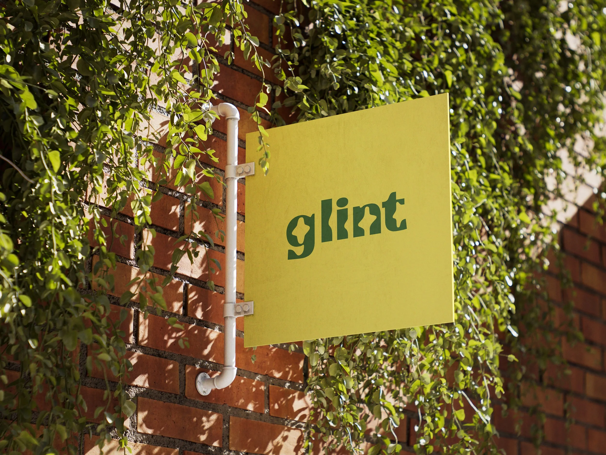
Glint

Glint | Where Earth Speaks
Brand Identity Design | Packaging Design
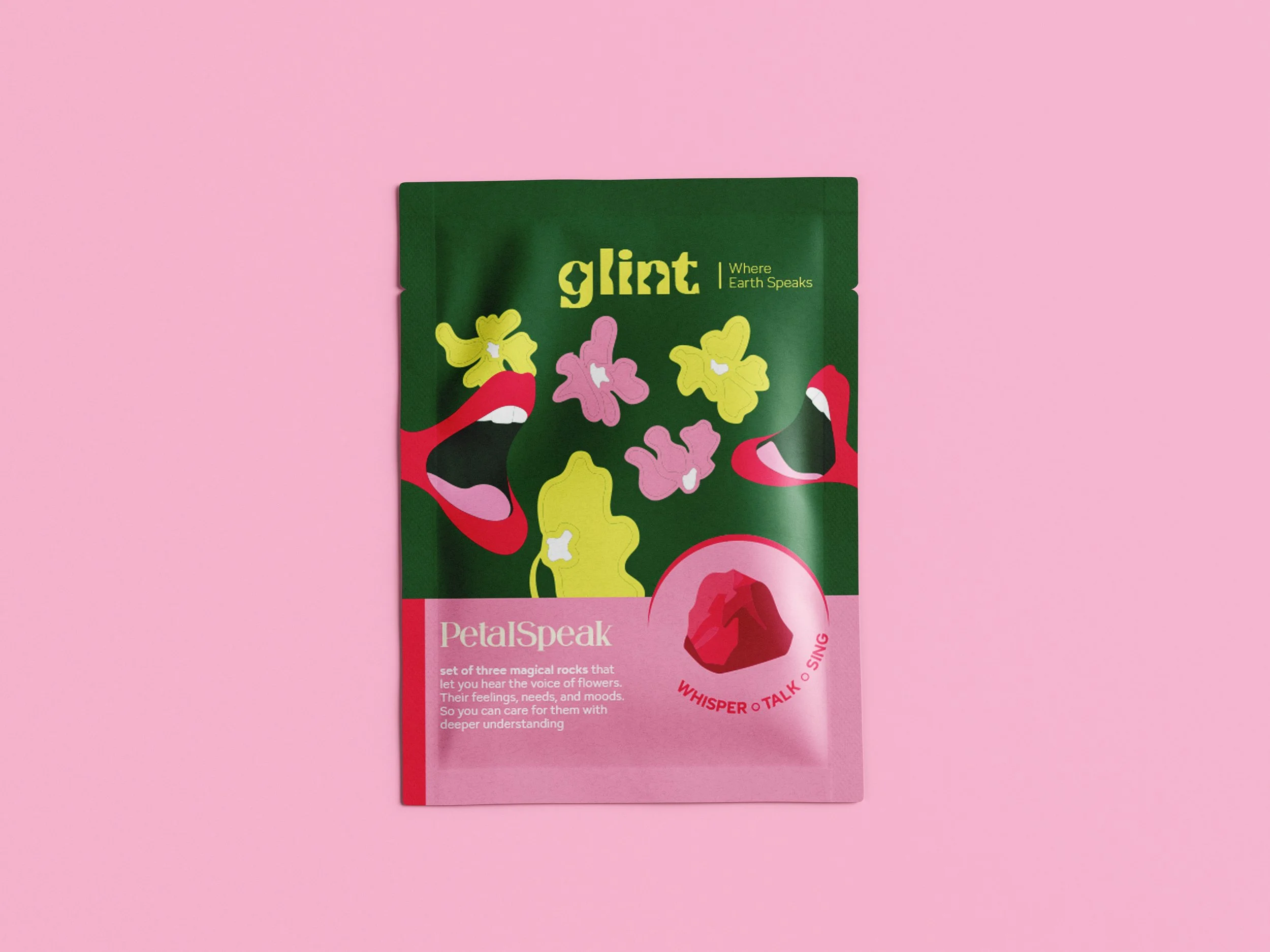
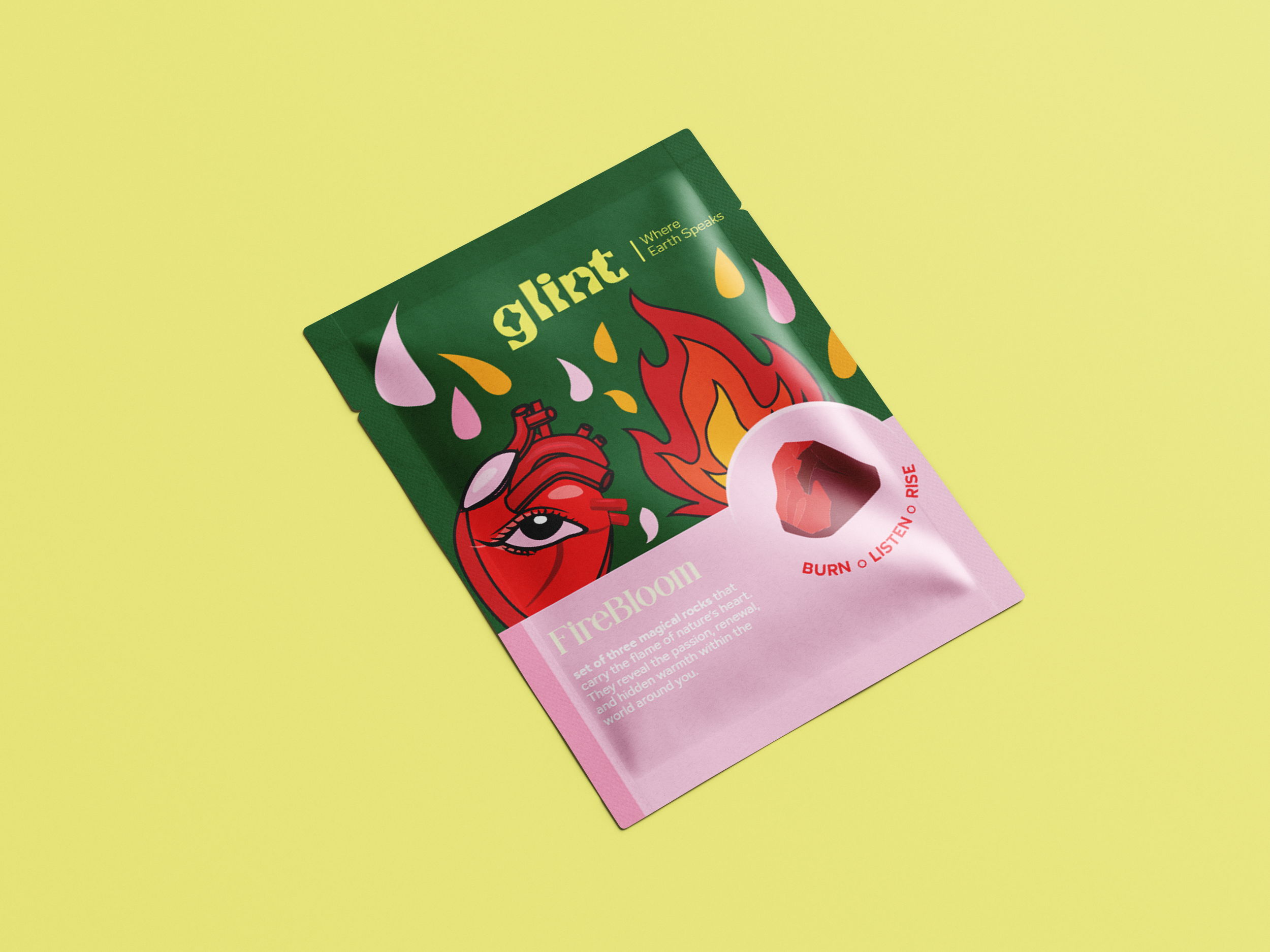
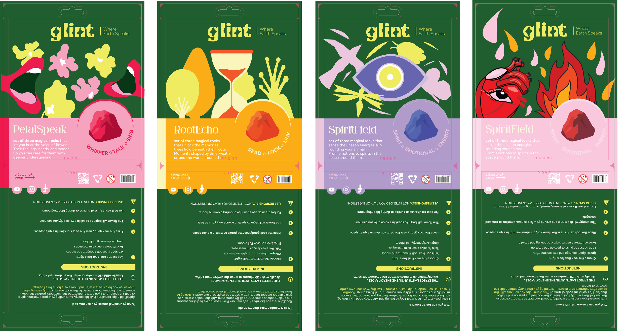
Glint is a conceptual brand built around a collection of magical rocks that give nature a voice. Each stone embodies a different element of the natural world — flowers, roots, spirits, and fire — allowing people to connect with Earth in playful yet meaningful ways.
PetalSpeak lets you hear the whispers of flowers, tuning into their moods and needs.
RootEcho unlocks the memories held deep within trees and soil.
SpiritField reveals the unseen energies that surround animals and spirits.
FireBloom awakens the fiery pulse of renewal and transformation at the heart of nature.
This project imagines Glint as a fantasy product line, designed with packaging that blends bold illustration and clear instructions to bring the stones to life. While fictional, the brand is positioned as if it were real — bridging product design, storytelling, and visual identity.
By acting as a bridge between humans and nature, Glint encourages people to listen more closely to the world around them. The tone is whimsical and magical, but the system is treated with the same structure and clarity as a real consumer product, making it believable and immersive.